Rebranding Case Study: Guiding a legacy of 70+ years into the future
When a retired occupational therapist and a retired registered nurse first opened their home to children with complex medical and developmental needs in 1947, their idea was a radical one. While the humble farmhouse and original duo have since expanded to a state-of-the-art campus and specialized teams, we preserved Cedarcrest’s unwavering passion and enthusiasm for their original mission with a vibrant, modern look and feel.
WHAT WE DID
Rebranding
Illustration
Website design
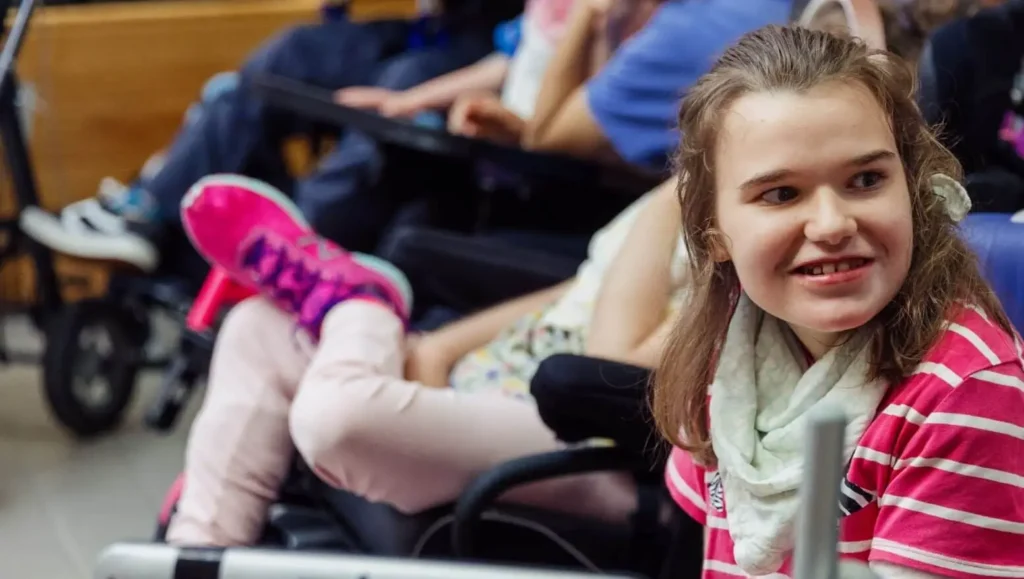
Photos courtesy of Cedarcrest
Rebranding
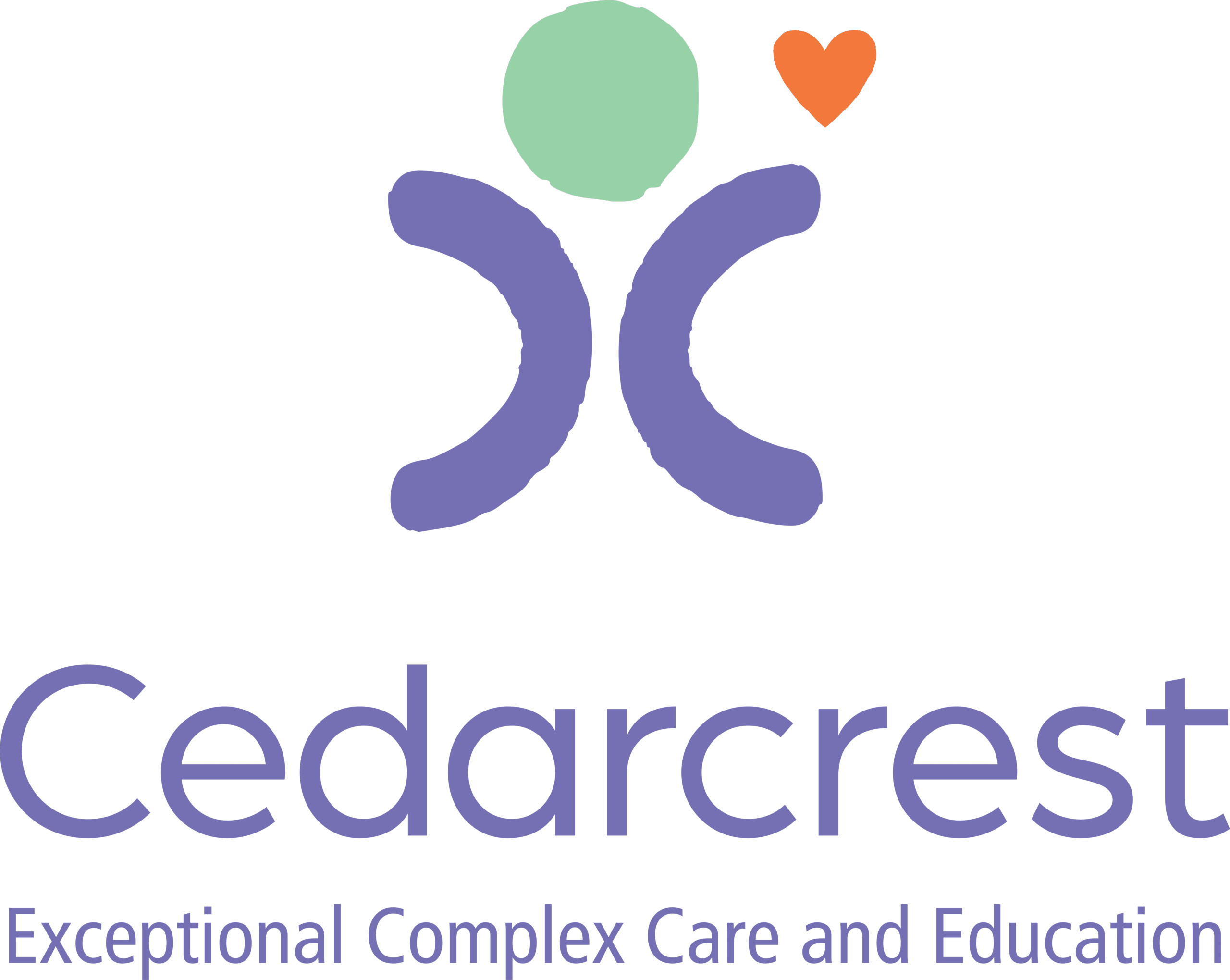
To find the perfect balance between honoring the past and modernizing for the future, we conducted a series of focus groups with Cedarcrest’s frontline staff, management team, advisory committee, board of directors, donors, volunteers, and medical referral partners. The extensive audience research provided specific direction for creating a refreshed brand that is poised to help a 70+-year-old organization continue to grow and thrive for the next 70 years.
BEFORE
AFTER
Illustration
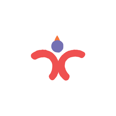
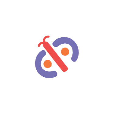
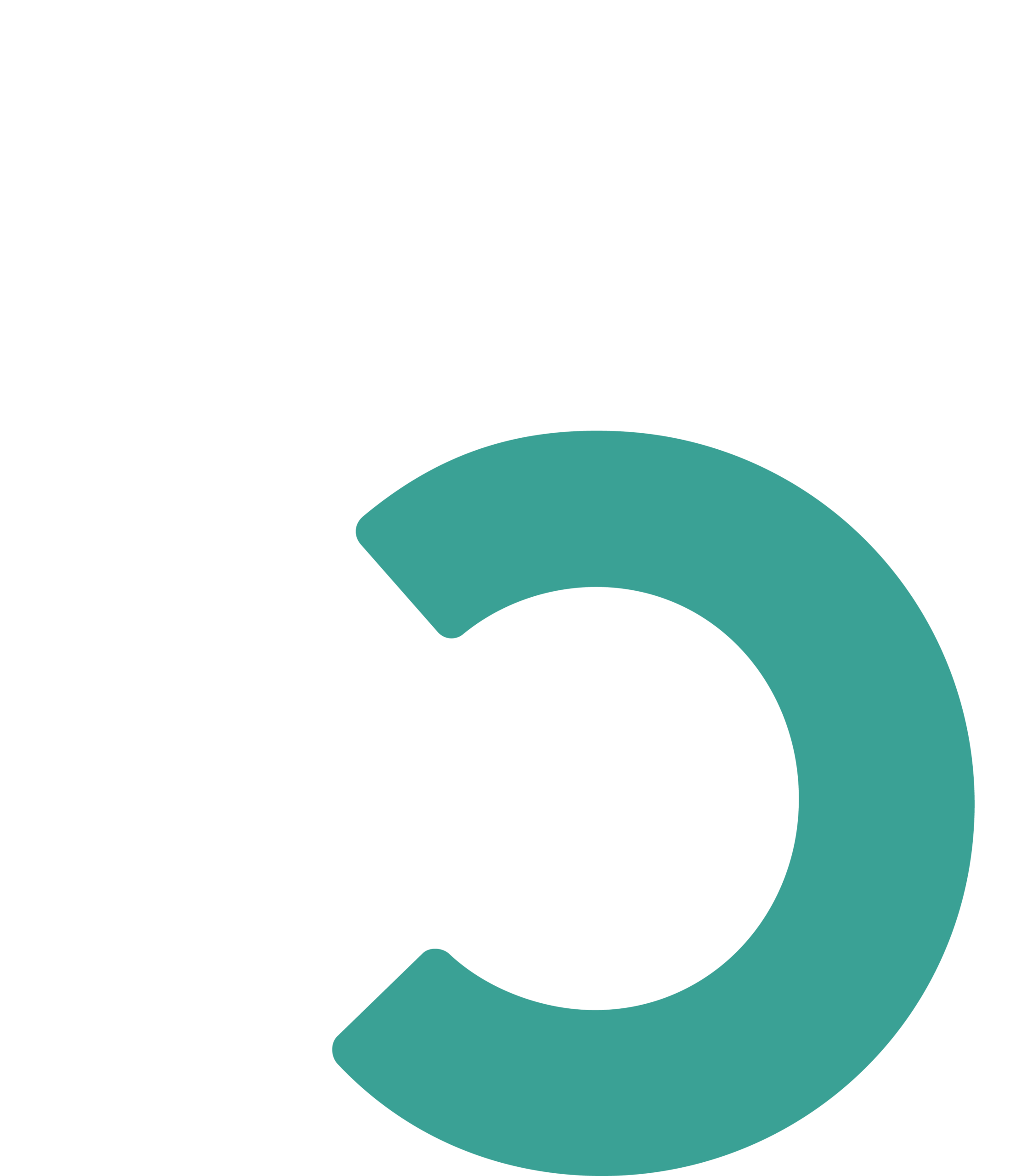
After establishing the new look and feel of the Cedarcrest brand, we leveraged the lively color palette and took inspiration from the artwork of their students and residents to create playful illustrations that reflect the joyful, caring spirit of the multifaceted organization. While various teams and services each have their own unique sub-brand, they complement each other and tie back to the overarching identity through their mutual starting point as the “C” in Cedarcrest.
Website design
To effectively convey the culture and nature of Cedarcrest, we created a clean, modern website that leveraged the extensive collection of high-quality photography of their campus and people. In addition to aesthetic updates, we also reorganized the overall site structure to provide a more fluid user experience with improved navigation and faster page load times.
“Cookson Communications has been instrumental in refreshing our brand and launching our new website. Their responsive, collaborative, and creative approach to rebranding, including logo and tagline updates, has helped us modernize while maintaining respect for our 77-year legacy. The team’s dedication to understanding our unique goals and providing expert guidance has been invaluable. We’re so grateful for their partnership in helping us achieve our vision.”
Contains information related to marketing campaigns of the user. These are shared with Google AdWords / Google Ads when the Google Ads and Google Analytics accounts are linked together.
90 days
_ga
ID used to identify users
2 years
_ga_
ID used to identify users
2 years
_gid
ID used to identify users for 24 hours after last activity
24 hours
_gat
Used to monitor number of Google Analytics server requests when using Google Tag Manager