
With people reducing screen time and opting to take a break from social media, print materials are ripe for a comeback. The perfect contrast to a crowded and chaotic digital landscape is a grounding piece of paper. I may not remember to go back to that email, but I will remember that flyer on my kitchen counter. According to The Harris Poll and Quad, 72% of Gen Z and millennials wish more brands focused on surprising them through the mail. As a Gen Zer myself, I appreciate holding something other than my phone in my hand. This is the perfect opportunity to incorporate some element of print into your marketing strategy.
As with any form of marketing, you should consider how to make the most out of a print campaign. Having impactful design gets you 80% of the way there, but without properly prepared files or a reliable printer, your collateral won’t make it to the finish line. Below are some guidelines to live by to ensure your print campaign hits the proverbial stands.
Content and design
The first thing to establish is the format that would best suit your content. There are plenty of options from direct mailers to flyers to educational booklets. If you want to advertise an event, a flyer would be an option. If you’re looking to advertise your various products or programs, a brochure would be a better solution.
Next comes design — consistency and hierarchy are key. This is where a brand guide is crucial. If your brand colors are blue and green, you don’t want the title of your flyer to be red. Although it would be eye-catching, it would not speak the visual language of your brand.
When inspiration strikes
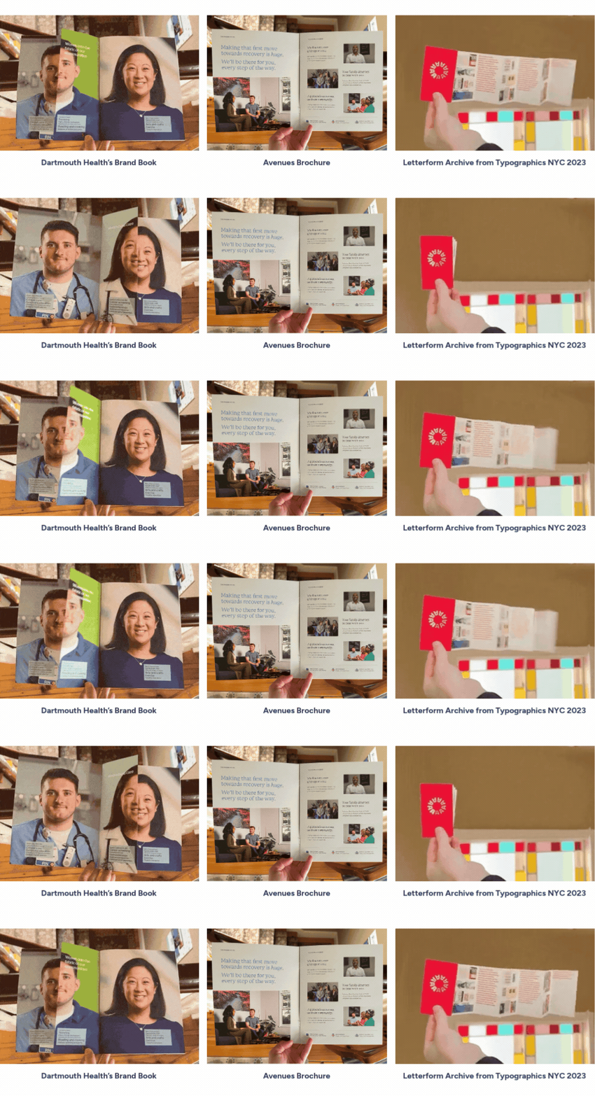
A great way to keep the creative juices flowing is to collect a swipe file. Anytime I spot a cool piece of mail, a funky business card or an unusual fold, I add it to the collection. These pieces help to jumpstart a project and prevent the dreaded creative block. Below are a few from my collection that stirred some sparks and made me say “aha!”
Preflight checklist
Once the design is perfected and approved, next comes the preflight checklist. In this phase, we answer these questions:
- Does that photo look blurry?
- I’m not sure that’s how you spell ‘definitely’?
Here is a basic guiding list:
- Have two sets of eyes proofread the content
- Ensure images are at least 150 ppi (300 is ideal)
- Test QR codes and links
- Add crop marks and bleeds
- Use CMYK color mode (bonus points if you know what those letters stand for)
Choosing a printer
When choosing the right printer, it’s recommended to compare not just price but quality of product and paper. Ask for samples of their work. If you need something to survive the mail or someone’s backpack, a sturdier stock will help get your message from point A to point B. If you have the option and it’s part of your brand, using Pantone Matching System (PMS) colors will help keep your print collateral consistent and easily recognizable.
Out in the wild
The final phase of the print marketing life cycle is implementation. Finding the right spot or the right people to hand out your advertising ensures your message gets to its intended destination. Determine where there is the most traffic, and the least visual clutter. With the right design and proper placement, your audience will want to reach out both literally and figuratively!
The print proof is in the pudding
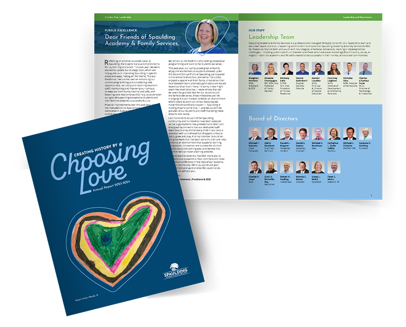
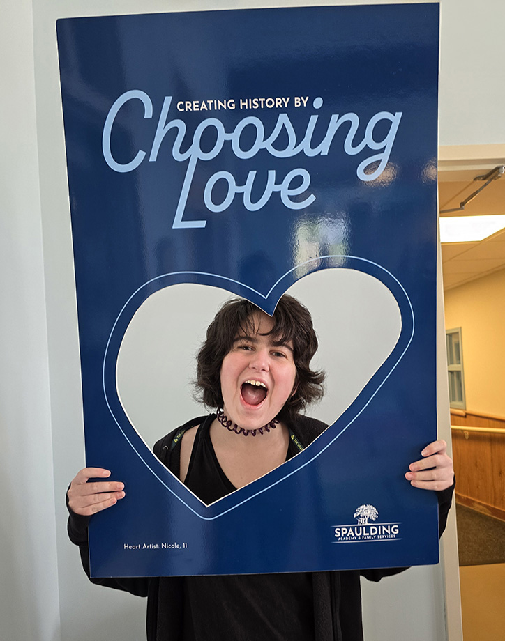
At Cookson, we have helped numerous clients put these print principles to the test with successful outcomes. For Spaulding Academy and Family Services, we designed an annual report that exemplified their commitment to the Choose Love Movement. We made the cover stand out with a custom die-cut based on one of the children’s drawings. This inspired a photo frame for special occasions, which helped further their mission and engage the community for candid photo-ops.
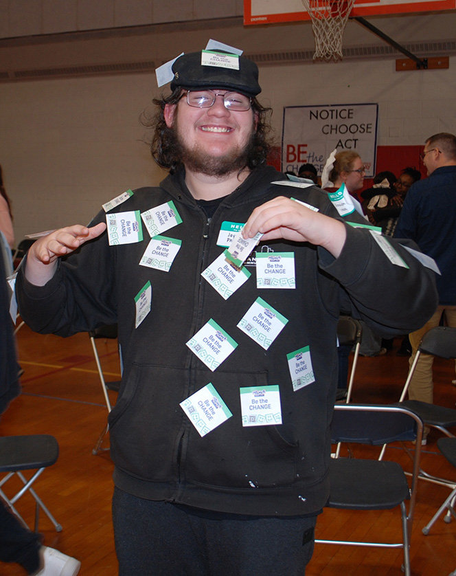
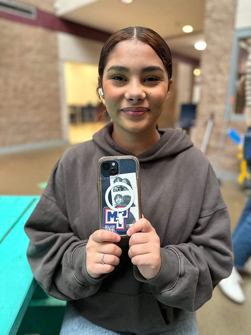
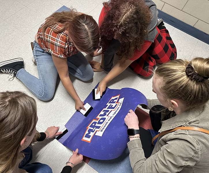
For the Manchester School District, we developed the M-Power campaign to promote mental health and school safety. To date, the M-Power sticker has more than 230 scans and has made its way around the district. Through sticky notes and signage, students got involved with the mission to help set their classmates up for success.
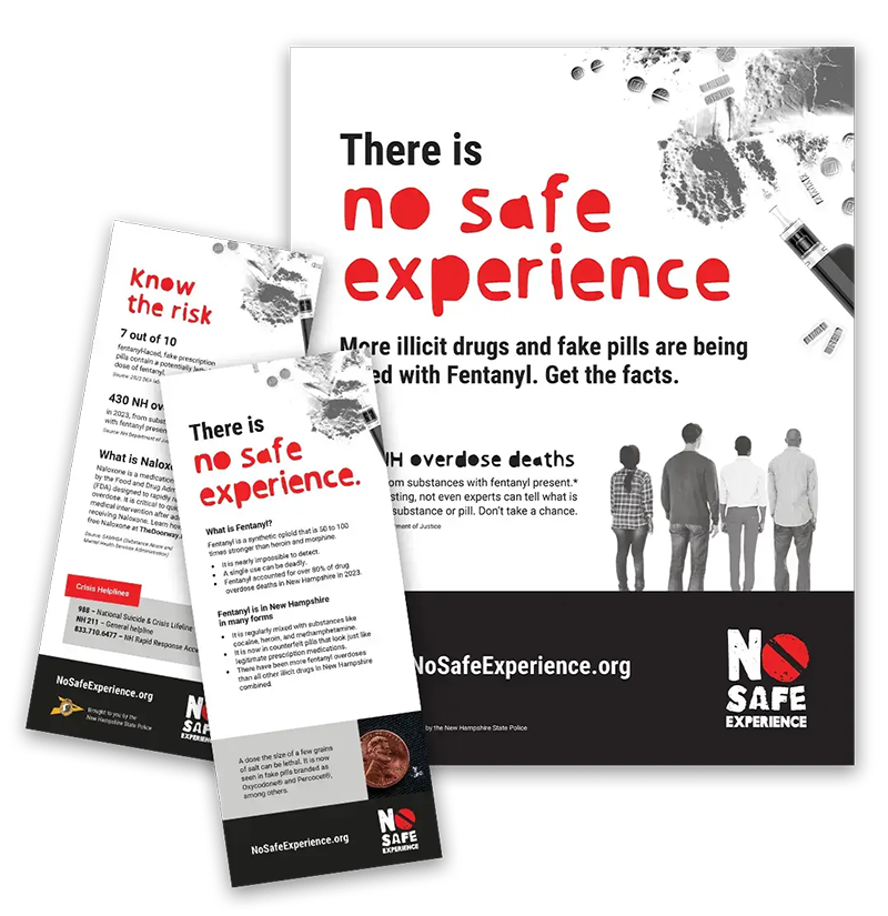
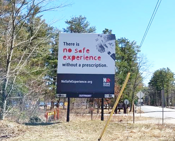
On a larger note — in the process of publicizing the statewide anti-fentanyl awareness campaign No Safe Experience, we created billboards for New Hampshire’s high-traffic areas. Our design hit the road and reached more than 4 million motorists. Combined with rack cards and posters, the public had multiple opportunities to learn that there is no safe experience with fentanyl.
Print media allows your audience to hold on to your message without getting stuck in a doom scroll. With millennials and Gen Z looking for a more tangible approach to their targeted advertising, there’s no better time than the present to take advantage of what print has to offer. Just don’t forget to consult with experts like our integrated team here at Cookson to make the most out of your time and budget. Check out a more condensed version of our print recipe here.