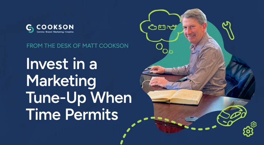

At some point, every organization needs to review their look, feel and messaging and ask themselves, “is my brand still relevant and aligned with my organization?” You cannot “have it your way” at McDonald’s forever, and “I’m loving it” will wear off when the romance is over. Dunkin’ successfully dropped donuts from their name, and DD seems to be thriving (although I am skeptical about dirty soda).
Whether it’s an update or a full brand overhaul, the process is complex. Tweaking is one thing; elevating your positioning is another. It touches everything – your branded “stuff,” website, physical space, social media, email marketing, advertising, business profile, core messaging – the list goes on.
We evolved as an organization and needed to reflect who we are today – a multi-faceted agency of talented communicators, storytellers and creators that take an integrated service approach to create positive impact for our clients. We do this with purpose by considering all aspects of branding/design, marketing and communications in our two-step discovery and implementation model.
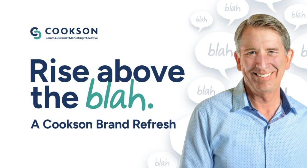
We’ve always leaned into our creativity and worked hard to “rise above the blah.” So, we grabbed hold of that concept and put ourselves through the same rigorous brand review process we honed for our clients. We asked ourselves the same questions we pose to them: Does our brand and how we visually present ourselves still work? Is it relevant? Are we “on message?” It is significant and thought provoking because our process forces you (and us in this case) to review everything from tone to target audience. See our chief creative officer’s blog on branding to get a full picture of our process.
We also thrive on collaboration and focus on optimism – we love overcoming challenges and creating opportunity. To capture our philosophy and tone, we filled whiteboards, involved the full team and took the time to do it right. In an increasing landscape of snark, we’re showcasing the uniqueness and no nonsense approach of our agency with rose-colored glasses (literally).
Our scope included core messaging, a new website, updated logo, updated navigation and SEO, back-end work to align with AI search engines, a top-to-bottom look at our service offerings, case studies, and overall user experience. We then took new design elements and messaging and extrapolated this work across everything else we share externally to ensure brand consistency. It’s a big punch list!
Our updated logo is clean – just the Cookson name and core service groups to help people know who we are and what we do – no nonsense! We even changed our URL – cookson.agency. It better represents us as an agency of humans who love what they do, care deeply about doing it well and enjoy doing it together.
We just completed this process and are psyched about our new look and feel. Woohoo!
I hope you’ll take time to poke around our new website. We had a lot fun with it. Check out our story and learn how ants played a role in our history. And if we can help you consider a refresh or rebrand, please do reach out.